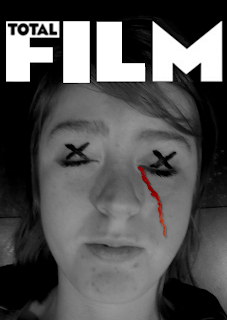
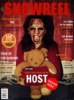
We were all given these examples of magazine covers, both professional and amateur. Though i chose two which have the strongest features and most eye catching cover, and the least attractive with the poorest of detail and features. They are as followed;
 Here is an armature example of a magazine cover, and is the poorest out of them all. Simply because the protagonist of the film is lacking in editing, effect and the only smidge of editing is, what i assume to be, the trail of blood down the right side of the cheek which is clearly added by paint due to the extremely pixilated outline and the over contrasting colour that does not go with the colour scheme. The masthead, however, is nicely cut out and easily eye catching, though the 'total' is all fuzzy which lets it down, par the lack of framing, dateline, poofs, anchorage, price line, sell lines etc.
 However, this cover completely contrasts the one above and is easily comparable on many levels. The elements of this cover like, for example, the colour scheme and lack of text clutter pays homage to professional magazines such as Total Film and Empire. Though i feel the backdrop is too armature, in a way, along with the slight over extremity of blood and gore on her face, making me question if such extremity would allow it to sit on a magazine rack in a shop where kids would see it.
Negativity pushed aside, this is a really eyecatching and impressive cover especially for a students piece of work.


No comments:
Post a Comment