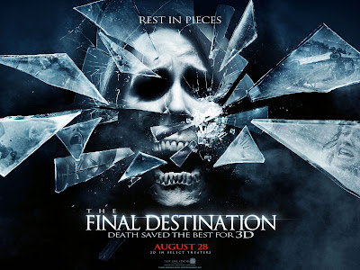
We looked at four different posters and arranged them in a order that is most effective, the order went as followed;
We all came to the conclusion that most, if not all, horror posters are dark and they key is not to give too much of the plot away.
House at the end of the street is a pretty bad poster, as it consists of a pretty girl pouting. It would be a bit more effective if she was cut up or muddy/sweaty. That and the figure in the background of the image in the house, which i would assume to be the villain/twist in the movie, is blended into the darkness and the strain and focus to see it shouldn't happen.
Cabin in the Wood was difficult, for me it didn't appeal as a poster or film. It is just a cabin shaped as a rubix cube, with the tag line 'you think you know the story' underneath. Now, i would be confused as to knowing weather this is a horror, action or sci-fi because it lacks information.
However, the Paranormal Activity poster is a lot more appealing, the couple screaming and staring at something across the bed is interesting as it is, yet looking in the direction they are you can see a tall dark image in the hallway which is an automatic scare and so much more effective than the previous two posters.
Although, the Final Destination poster is my higher choice. Due to the screaming face, the to half being human and the eyes are darkened and the bottom half is the jaw of an open mouthed skull, implying its fear. Those who know these films know the plot and that the shattering glass is an excellent reperesentation of the film and what it's really about.


No comments:
Post a Comment