Location Shot;
We came across a lush green, covered pine forest just near my home in Catterick. It has all the elements of the ideal location to shoot in, its covered so when it rains we wont get wet or hurt ourselves, its not over contrasting, light doesn't stream too brightly and it has a light and spongy ground.
Photo shoot;
The final picture from my photo shoot really does follow the 1940's theme we are aiming to achieve. The make up and hairstyle along with the pose conditions the theme of 'Psychological Horror' and should help produce the message we aim to get
Friday, 14 December 2012
Wednesday, 14 November 2012
Rough magazine
Here is a rough sketch/idea for my magazine cover, clearly inspired by the Anne Hathaway Empire cover. I am not going to include any bright colours, so my colour scheme will be mainly black, white and grey. Along with the non cluttered space that surrounds the image, i'll include a few small lines of text, pictures or upcoming movies and a few puffs.
 |
| This is my style model, i have used the central image as my own though with the addition of the grabbing hands which pays homage to the Drag Me To Hell poster. |
Monday, 12 November 2012
Tuesday, 16 October 2012
'Lets get thinking'
Why would someone want to go and watch your film?Each element of the film is different in each way, well in comparison to existing psychological horror films. One reason being that it is set in an earlier era, where asylums were at their worst, unlike any horror film produced now days where it is all modern and more blood and gore than challenging the mind. I hope to create a trailer that doesn’t give too much of the storyline away, yet it draws the target audience in.
Who are the target audience and how will you attract them?The target audience we have chosen is 16-25 year olds, they will grab the concept of the film and won’t be confused like, say, a 12 year old would. It is known that younger people are more drawn to horror films than the older generation. By the audience seeing the elements we shall involve and leave out in the trailer should draw them in; we wish to involve small bits (from the notes we have taken from example trailers) which are perplexing enough for them to see it.
What is the USP of your film and why?Personally, I think the USP is the hint of different inspirations of each trailer we watched and analysed. Though this is an extremely strange USP to have I think that is what makes it so much more unique, it is clear that ‘Sanatorium’ pays homage to the influence of ‘The Ward’ such as the whole idea of it being in an asylum echoes the clinical theme of The Ward. However it does not mirror it in any way at all, as it also soaks in the idea of the photography set in the opening trailer of ‘Silent House’, elements such as the provided examples makes our trailer ever more so unique.
How will you have evidence of a variety of shot types, camera movement, editing and transitions?Well with the technology and software provided by the department we shall use the following equipment;
o Imovie 06 and Final Cut Express 4
o Audio software
o Camcorders- using digital video tapes
o Mac computers
o Photoshop
I shall also provide screen captions, daily blog posts on ‘Blogger’ where It enables us to provide rough cuts of our work, along with podcasts of our plan for the week or how we progressed that previous day. Putting together multiple videos of the variety of shots we shall be using, along with the gradual progression of our editing via Final Cut Express 4 and Imovie 06. All of this, as I said, shall be provided weekly.
How does the music you have created/will create match the genre?
The planned music is to be an eerie, jack in a box simple tune which will result in a fast paced climax ending. The reason being is that most psychological horrors are creepy and make the audience sceptical so by adding such a taunting and not particularly lively melody followed by a deep beat whilst things are gradually revealed then a blank silence, then the editing gradually picks up pace – end of trailer. But the main part of the effect is the innocent melody at the start, as it sets up a non expected ending as it is so effective. (Though this method is a lot more frequently used nowadays)
Will you change your conventions at all with your trailer?
The expected genre features are;
· Dark lighting
· Blood
· Thriller
· Idiocy
· Attractive teenagers
· Killers/villain
· Torture/death
· Tension
· Loud noises/screaming
· Fast pace editing
· Build up of tension
· Enhanced diagetic sound
The trailer contains only a few of these features;
- Blood
- Killers/villain
- Torture/death
- Loud noises (when fast paced editing)
- Build up of tension
- Diagetic sounds (panting, hospital sounds)
Seeing as these are expected, and play such a huge part in a psychological horror then we don’t need to alter them in any way.
- Blood
- Killers/villain
- Torture/death
- Loud noises (when fast paced editing)
- Build up of tension
- Diagetic sounds (panting, hospital sounds)
Seeing as these are expected, and play such a huge part in a psychological horror then we don’t need to alter them in any way.
How will the trailer fulfil audience expectations follow the conventions of a trailer?
As I already stated in the previous question, we shall be using multiple conventions;
- Blood
- Killers/villain
- Torture/death
- Loud noises (when fast paced editing)
- Build up of tension
- Diagetic sounds (panting, hospital sounds)
- Killers/villain
- Torture/death
- Loud noises (when fast paced editing)
- Build up of tension
- Diagetic sounds (panting, hospital sounds)
This is what ours is going to consist of, but instead of having the constant cuts and snappy editing from the start, it will only happen in the establishing shot and the fast paced editing at the end – resulting in a tension building trailer, meeting the audience expectations.
Does it follow Todorovs narrative?Todorov attempted to create a simple technique that applies to many stories’ structure. This was his theory, he said that there has to be a beginning to set up the events of the story, there then has to be an disruption to these events. There then has to be a resolution to restore the order and make a new equilibrium (beginning)
Do you have any of Propps characters narrative in the trailer Propps narrative is used in the trailer, though it only consists of 4 snippets of his narrative - it contains;
- Absentation - A member of a family leaves the security of the home environment. This may be the hero or some other member of the family
- Interdiction - An interdiction is addressed to the hero ('don't go there', 'don't do this')
- Violation of Interdiction - The interdiction is violated (villain enters the tale)
- Delivery - The villain gains information about the victim.
Monday, 15 October 2012
Audience Profile
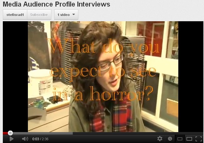 We hired out the camera for a few hours and decided to build up our Audience Profile, we asked a variety of questions about the aspects of horror films. You can find the video here;
http://www.youtube.com/watch?v=6jMzqwJ-NnY&feature=g-upl
Time Table
Here is a timetable that i put together, it organises what we have done and what we plan to do to gradually develop our film. It involves out location shots, research days, editing days and magazine/poster sessions - all week by week.
Risk Assessment
When persuing on Shot Location research we noticed that our chosen location created a list of hazards, so before filming we filled in this Risk Assessment to ensure the risks were reduced.
Monday, 8 October 2012
Horror magazine covers
We were all given these examples of magazine covers, both professional and amateur. Though i chose two which have the strongest features and most eye catching cover, and the least attractive with the poorest of detail and features. They are as followed;
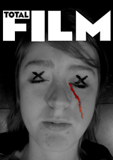 Here is an armature example of a magazine cover, and is the poorest out of them all. Simply because the protagonist of the film is lacking in editing, effect and the only smidge of editing is, what i assume to be, the trail of blood down the right side of the cheek which is clearly added by paint due to the extremely pixilated outline and the over contrasting colour that does not go with the colour scheme. The masthead, however, is nicely cut out and easily eye catching, though the 'total' is all fuzzy which lets it down, par the lack of framing, dateline, poofs, anchorage, price line, sell lines etc.
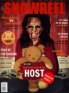 However, this cover completely contrasts the one above and is easily comparable on many levels. The elements of this cover like, for example, the colour scheme and lack of text clutter pays homage to professional magazines such as Total Film and Empire. Though i feel the backdrop is too armature, in a way, along with the slight over extremity of blood and gore on her face, making me question if such extremity would allow it to sit on a magazine rack in a shop where kids would see it.
Negativity pushed aside, this is a really eyecatching and impressive cover especially for a students piece of work.
Thursday, 27 September 2012
Film poster analysis
We looked at four different posters and arranged them in a order that is most effective, the order went as followed;
We all came to the conclusion that most, if not all, horror posters are dark and they key is not to give too much of the plot away.
House at the end of the street is a pretty bad poster, as it consists of a pretty girl pouting. It would be a bit more effective if she was cut up or muddy/sweaty. That and the figure in the background of the image in the house, which i would assume to be the villain/twist in the movie, is blended into the darkness and the strain and focus to see it shouldn't happen.
Cabin in the Wood was difficult, for me it didn't appeal as a poster or film. It is just a cabin shaped as a rubix cube, with the tag line 'you think you know the story' underneath. Now, i would be confused as to knowing weather this is a horror, action or sci-fi because it lacks information.
However, the Paranormal Activity poster is a lot more appealing, the couple screaming and staring at something across the bed is interesting as it is, yet looking in the direction they are you can see a tall dark image in the hallway which is an automatic scare and so much more effective than the previous two posters.
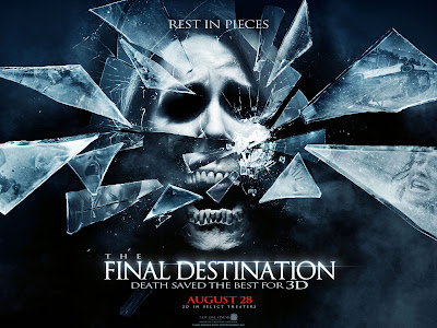
Although, the Final Destination poster is my higher choice. Due to the screaming face, the to half being human and the eyes are darkened and the bottom half is the jaw of an open mouthed skull, implying its fear. Those who know these films know the plot and that the shattering glass is an excellent reperesentation of the film and what it's really about.
Magazine idea
Empire Magazine template
IDEA
- Anne Hathaway - Catwoman
- Grey/ black background
- Black/white text
IDEA
- The stance of the older the shoulder glance, back showing
- Maybe a white background(?)
- White nightdress
- Deteriorated hands grabbing her legs from underneath or around her waist
- facial expression to be an evil smile or grin
Friday, 21 September 2012
Teaser trailers (20 seconds)
Woman in Black
- Music - eerie
Boom/ pounds sound everytime a new shot is shown
Shot -dark - shot - dark (edit)
Conversation music (non diagetic)
Ident of pictures - start 'Hammer'
Close up*
Established shot - the house
Extreme long shot
Transitions - fade between shots
* = first shot of human
- Ident of pictures
Boom - (non diagetic sound)
Camera shutter sound (non?)
Voice over - non diagetic provide info
(the only light it the camera flash)
Angles are tilted - handheld - more realistic
No music - only scribbling on paper, iftting in with the whole transition
Lack of footage
- Music - pop/punk band
Light settings - not dark like 'Silent House'
Close up
Establishing shots
Unable to tell it's a horror
- Handheld camera - realistic
Idents
Diagetic - voices in the car, sound of the engine ect.
Cut shots - fuzzy, TV screen on with no signal
Saturday, 15 September 2012
Poster idea
- The several hands grabbing the body from below, expression screaming
- I could change the background to a white room, or a forest
- The several hands around her could represent the split personalities
Although a lot of elements from The Ward have inspired our trailer, the poster happens to be just as interesting and eye catching as well;
- The main character is in a ripped and filthy white nightgown, screaming and showing restraint from the hands that have hold of her arms
- The background is black, which already gives off the hint that it is of the horror genre
- The only negative thing about this poster is that remaking something similar would be difficult
The one i am leaning towards is the 'Drag Me To Hell' design, because each part of the poster is what i would want to see in a horror poster, and what i am aiming to include in my own. The idea of hands grabbing the main character downwards - showing dominance which is what would represent her split personalities, and the part they play is what overpowers her and forces her to do things against her own will.
But to include and remake all of this would look a bit unoriginal and the idea would not be my own.
So I'm going to combine the two ideas together, with the main character's back facing the camera, her head glancing over her right shoulder whilst she would be muddy, dressed ripped and her hair wet and draping over her face, the smirk on her face and the hands grabbing either her legs or from behind her waist.The background would cause a problem, seeing as most of our shooting would be in a forest and a white room, so either of the two would be prefect. Though to find a white room with a simplistic bed and the shadow of the window creeping into the shot would be hard to find, also the fact of her being muddy, ripped and wet in a clean room would not make sense, so the woods would kind of piece it together.
The image below is a possible model idea of what my image would look like, though to remake this without it looking armature will prove a difficult task.
Friday, 14 September 2012
Magazine cover research
After looking through magazine covers and seeing ones that are overflowing with text and mismatched colours, i came across these; they caught my eyes because they are simple, one image/figure covers with simplistic and neutral colours.
If my cover was to have bright colours then it would defeat the object of a horror film cover, as the horror genre is dark, mysterious and reasonably scary.
I am planning to sort of mirror my cover to the Empire one with Anne Hathaway as catwoman as the model.
The reason being, that the stance is simple yet the colours are dark, also to use this stance would also need a few other touches to accompany it due to the plot of the story.
Thursday, 13 September 2012
Thursday, 16 August 2012
Camera Angles
1) Bird’s-eye view:
A Bird’s-eye view shows a scene from overhead. Overhead of your character or even to show the setting but the shot doesn’t show anything as clearly as you may think it is. This camera shot makes the audience feel like ‘God’ as God watches over everything that happens over our heads. People would look as tiny as ants and that also makes the audience feel tall and proud.
A Bird’s-eye view shows a scene from overhead. Overhead of your character or even to show the setting but the shot doesn’t show anything as clearly as you may think it is. This camera shot makes the audience feel like ‘God’ as God watches over everything that happens over our heads. People would look as tiny as ants and that also makes the audience feel tall and proud.
2) High Angle:
This angle is similar to the Bird’s-eye view but not as high up. The camera is slanted in the action, hovering over the sides of the heads. This makes whatever you are trying to focus on smaller and insignificant. This action becomes part of a wider scale.
This angle is similar to the Bird’s-eye view but not as high up. The camera is slanted in the action, hovering over the sides of the heads. This makes whatever you are trying to focus on smaller and insignificant. This action becomes part of a wider scale.
3) Eye Level:
The eye-level shot is placed in level with a character’s face as if the audience is watching in level with the focus.
The eye-level shot is placed in level with a character’s face as if the audience is watching in level with the focus.
4) Low Angle:
Low angles are mainly used to give an effect of how small you are to the world. Low angles shots give a sense of powerlessness and makes you feel useful in the scene and this type of camera angle would be useful for short actors like Danny Devito or Tom Cruise.
Low angles are mainly used to give an effect of how small you are to the world. Low angles shots give a sense of powerlessness and makes you feel useful in the scene and this type of camera angle would be useful for short actors like Danny Devito or Tom Cruise.
5) Oblique/Canted Angle:
An Oblique/Canted Angle can be sometimes tilted which is used in many popular horror movies to indicate to the audience that the scene is unstable, or ‘something is going to go wrong’. This shot suggests the ‘point of view’ of a character.
An Oblique/Canted Angle can be sometimes tilted which is used in many popular horror movies to indicate to the audience that the scene is unstable, or ‘something is going to go wrong’. This shot suggests the ‘point of view’ of a character.
Camera Movement
| Crab | A less-common term for tracking or trucking. |
| Dolly | The camera is mounted on a cart which travels along tracks for a very smooth movement. Also known as a tracking shot or trucking shot. |
| Dolly Zoom | A technique in which the camera moves closer or further from the subject while simultaneously adjusting the zoom angle to keep the subject the same size in the frame. |
| Follow | The camera physically follows the subject at a more or less constant distance. |
| Pan | Horizontal movement, left and right. |
| Pedestal (Ped) | Moving the camera position vertically with respect to the subject. |
| Tilt | Vertical movement of the camera angle, i.e. pointing the camera up and down (as opposed to moving the whole camera up and down). |
| Track | Roughly synonymous with the dolly shot, but often defined more specifically as movement which stays a constant distance from the action, especially side-to-side movement. |
| Truck | Another term for tracking or dollying. |
| Zoomb | Technically this isn't a camera move, but a change in the lens focal length with gives the illusion of moving the camera closer or further away.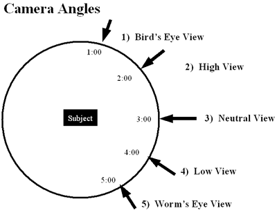 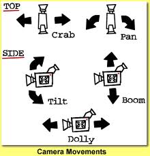
Camera Shot Angles
1) Extreme Long Shot (ELS):
Extreme Long Shot’s are used mainly to set the scene of the movie you are trying to create. It usually shows the outside of a building or even a landscape to give the audience a brief idea of where the scene takes place.
2) Long Shot (LS):
This shot is difficult to use because it determines the actual size of an object you are trying to show. This corresponds with the real distance between the audience and the screen in a cinema or the TV.
The shot requires a FULL SHOT showing the entire human body with the head near the top of the frame and the feet near the bottom, not cropping anything out.
3) Medium Shot (MS):
A Medium Shot is usually used for dialogue scenes, only showing the human from the waist and upwards. If more than three figures are shown in the scene then this eventually becomes a long shot. People use these shots because they want the audience to concentrate more on the people and very little setting is shown – probably the director has already shown the setting of the scene before this shot and it is no longer needed to be repeated on a wide scale.
4) Close-Up Shot (CUS):
A Close-Up Shot is mainly used to concentrate on a face or a particular Mis-en-scene showing very little background. The director may choose to make the background a blur to gain the audience’s attention on what he/she wants to be mainly seen. Close-Up Shots can be focused on objects or a character’s facial expression which takes up the mind of the character.
5) Extreme Close-Up Shot (ECU):
The Extreme Close-Up Shot magnifies beyond what the human eye would imagine in reality. An extreme close-up of a face of a human would only show the eyes or the mouth covering up the whole screen with no background included. This shot is usually used to make a dramatic and tense effect.
|
Wednesday, 15 August 2012
Analysis of 'The Ward'
As 'The Ward' is quite similar to the idea of our trailer, I have decided to do an analysis of it.
- set in an asylum, seems quite old fashioned
- use of fire
- typical horror film music, quite and eerie, then loud
- use of a psychiatric doctor/nurse
- the main character doesn't know why she has been sent to the hospital "i'm not crazy"
- lighting is bright and white
- use of a dark figure that the girl called a 'ghost'
- "its going to kill us all"
- flickering lights used on the words and in the footage
- stretcher prop to show they are in hospital
- screeches and screaming sound effects
- there is a main focus of an 'evil thing' - the burnt girl/figure
- "terror"
- use of blood
- the use of a few seconds of a plain black screen followed by a large part of the plot
- tension music that gets louder as the plot comes to light
- ends up a loud BOOM sound followed by the title, then has a vital part of the plot followed by the credits. this is effective as the audience thinks it is over when the title shows up, then they are surprised with more of the film.
Tuesday, 14 August 2012
Trailer Sound Type - Analysis
Psychological Film trailer sound track conventions - Asylum Theme
http://www.youtube.com/watch?v=HpqbJMd6n-U
With all the fast paced noises and the wide range of instruments that is used in any horror yet alone psychological i think that following the path of a Psychological horror is the best one to take. From the screams, build up of sound, jumpy, eerie, creepy and terrifying music i can really react as an audience myself, and that is the same reaction/connection i want the viewer to have when they watch our trailer.
- Eerie, creepy music
- Single piano notes
- Violin screeching
- Screams, yells, crying
- Shouting down an echoes corridor
- Door slamming
- Abrupt loud noises
http://www.youtube.com/watch?v=HpqbJMd6n-U
With all the fast paced noises and the wide range of instruments that is used in any horror yet alone psychological i think that following the path of a Psychological horror is the best one to take. From the screams, build up of sound, jumpy, eerie, creepy and terrifying music i can really react as an audience myself, and that is the same reaction/connection i want the viewer to have when they watch our trailer.
Monday, 13 August 2012
Producer, Director and Distributor rolls
Roll of the Producer;
Film producers prepare and then supervise the making of a film before presenting the product to a financing entity or a film distributor. They might be employed by a film studio or be independent, yet either way they helm the creative people as well as the accounting personnel. Producers can often not personally supervise all parts of their production. The reasons are many. For example some producers run a company which also deals with film distribution.
Director;
A film director is a person who directs the making of a film. Generally, a film director controls a film's artistic and dramatic aspects, and visualizes the script while guiding the technical crew and actors in the fulfilment of that vision. Film directors create an overall vision through which a film eventually gets made. Realizing this vision includes to oversee "the cinematography and the technical aspects" as well as directing the shooting timetable and meeting deadlines.
Distributor;
Often looked on as middlemen that add costs to material purchases, distributors are, in fact, a vital link in the composites industry, bringing tangible benefits to both material suppliers those manufacturing the materials and end-users. The distributor, who buys large material quantities from a supplier/manufacturer, then creates smaller material units and delivers those units to many customers, in a timely fashion. They are distinct from brokers, who neither take delivery or nor title to the material, and surplus buyers, who typically buy aged material or overage and resell it at a discount.
Saturday, 11 August 2012
Storyboard
This is a rough storyboard for our trailer.
1. we will have our main character (the girl) running through a wood/a field in a nighty that resembles a hospital gown - then she will be dragged away by people dressed in hospital scrubs.
2. next we will have a clip of the girl on a stretcher, filmed from above while she is lying down. this will be edited to be black and white and will signify a flashback of the girls life.
3. there will there be a shot of the girl dropping old, burnt photographs of her and her family. this shot will be edited into a freeze, so the audience can get a good look at the photos and the people in it. this will then fade into the next clip.
4. the next clip will be the conventional part of a trailer where words appear on the screen to give the audience more information on the film.
5. the next clip will be a scene where the girl is in a room or a bedroom talking to the characters in her head. her (real) friend walks in and sees her, it looks like she is talking to no one, as she is the only one in her room, talking to herself.
6. next there will be a scene of the girl and her real friend having a conversation about her having a problem, which the girl denies.
7. there will then be more words to give more information.
8. there will then be another black and white flashback of a doctor looking down on the girl and giving her an inspection.
9. next will be a clip of the people in the girls head all shouting different things at her, and the girl looking scared.
10. more words.
11. for the next 20 or so seconds there will be a montage of fast edited clips with flashes on light. the music of the trailer will pick up in pace for the end title.
12. the title of the film will then appear but a loud end to the music.
13. after the title and some credits, an end scene will play of the girl holding a knife and a girl (her sister) next to her, with blood all down her dress.
Subscribe to:
Posts (Atom)


